This guide serves as an extension of the university’s primary brand style guide. Be sure to review and familiarize yourself with the main guide, as it covers areas not addressed here.
Guiding Principles
Integrate Aesthetics with Learning Objectives
Designing aesthetically pleasing content is important, but it should never overshadow our primary aim: to facilitate effective learning. Each design choice should be aligned with instructional goals, ensuring that our visuals not only attract attention but also enrich the educational experience.
Strive for Design Consistency Within the Course
It’s common for multiple designers to work on the same course. Proactively collaborate with fellow designers and review any existing content for the course you are designing to ensure consistency in the media content.
Prioritize Diversity and Inclusion in Media Content
When selecting characters or stock images for media content, it is essential to represent diverse groups of people. Aim to reflect a range of identities, including but not limited to race, ethnicity, gender, age, ability, and socioeconomic status. This commitment not only enriches the learning experience but also fosters a more inclusive environment, allowing all learners to see themselves represented in the materials.
Color
The primary and secondary color palettes should be closely adhered to for elements that establish our design framework, such as design templates and player UI stylings. However, there is creative freedom for the content created and presented within these elements. For instance, a course introduction video should utilize our video intro and outro templates that incorporate these color palettes, but the content beyond these elements is at the designer’s discretion.
Primary Colors
Main Purple
#561E66
Light Purple
#88288A
Dark Purple
#360040
Dark Blue
#00629B
Med Blue
#62B5E5
Light Blue
#BAE8F5
Dark Red
#6E0A3B
Med Red
#9e0052
Light Red
#ce0058
Secondary
Light Green
#8BB346
Med Green
#4d8f45
Dark Green
#005D37
Yellow
#fec926
Orange
#dc6718
Black
#000000
Dark Gray
#464646
Med Gray
#969696
Light Gray
#e1e1e1
White
#ffffff
Typography
Typefaces
Primary
Figtree is our primary typeface and should be used most of the time.
Secondary
Source Serif 4 and Oswald are our secondary typefaces. If used, limit them to short blocks of text such as titles, headings, and subheadings.
Accent
Our primary and secondary typefaces form our design base, but accent fonts can be used to add creative emphasis or highlight specific themes (e.g. 8-bit digital typeface for computer code).
Text Styles
Contrast Ratio
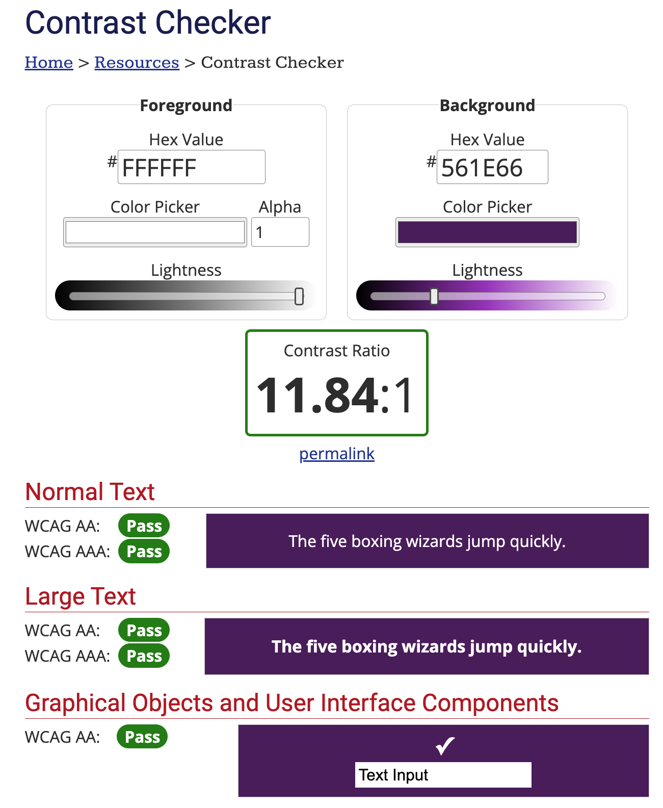
All text must meet Web Content Accessibility Guidelines (WCAG) 2.0. Always ensure you’re meeting these guidelines by using the WebAIM Contrast Checker. It’s important to note that slight adjustments to our brand colors may be necessary in certain situations to meet contrast requirements, and that’s perfectly fine.
Color-Independent Contrast
Ensure text emphasis doesn’t rely solely on color; incorporate additional cues like bolding, underlines, or icons for clarity and accessibility.
Typographic Elements
Prioritize the functional purpose of text styles such as bold, italics, and underlines before their aesthetic appeal. Strive for a balance that enriches understanding while maintaining a pleasing visual design. These styles can be used to underscore key terms, establish visual hierarchy, and categorize information, all of which contribute to better understanding.
Titling Conventions
- Minimize the use of identifiers like module, presentation, video, or course code.
- If course code inclusion (e.g. course introduction) is warranted, format it in uppercase without spaces.
- Use language that describes the content itself rather than its format or organizational context.
- Formatted in title case.
- Maintain consistent application of conventions throughout a course.
Examples
eng 300: Course Introduction
ENG 300: Course Introduction
ENG-300: Course Introduction
ENG300: Course Introduction
Course code is in uppercase without spaces.
Module 1: Supply and Demand Curves
Presentation: Supply and Demand Curves
Module 1 Introduction
Introduction to Supply and Demand Curves
Describe the content, not its format or organizational context.
Design Templates
Course Templates
Four design templates are used in course media.
Three of the four are our own: a PowerPoint for presentations and two MOGRT files for video, intro and lower thirds. Each follows a unified design with three color options—purple, blue, and red—and two style variations: colorful and single-hue. The presentation and video title templates also include subject-specific icons from Smashicons – Basic Miscellany Lineal
The fourth is .mov outro created by marketing.
Access
The PowerPoints are on SharePoint and the video intro and lower third templates are in our CLMS Adobe Creative Cloud Library. The video outro is in the Excelsior University Adobe Creative Cloud Library. The preferred workflow for the video titles is to add them from Libraries window in Premiere Pro.
Template Selection
There are no specific guidelines for selecting color or style variations for a course, but only one variation should be used throughout—mixing is not permitted. The designer of the first media piece will determine the chosen color and style.
Library Templates
Two design templates are used for library videos: both are MOGRT files for the intro and outro segments, available in our CLMS Adobe Creative Cloud Library.
Presentations
In our work and team context, “presentation content” refers to presentation slides accompanied by audio narration. Most of this content is created in PowerPoint and delivered through the Storybook+ player.
Slide Design Conventions
- Use our course PowerPoint templates.
- Visual design elements—such as color, text styles, images, and graphics—should enhance understanding. Be intentional and consistent in their application.
- Avoid overly dense slides by using concise text and visuals, and break content into multiple slides as needed.
- Slide content should complement audio narration rather than duplicate it, using concise text and visuals that emphasize key points and enhance understanding.
- Ensure slide titles are succinct, meaningful, and relevant to the slide’s purpose and content. Use sequencing names only as a last resort for creating unique titles.
Storybook+ Player
For a comprehensive technical guide on using the Storybook+ player, please visit Storybook+ Technical Specifications.
Splash Screen
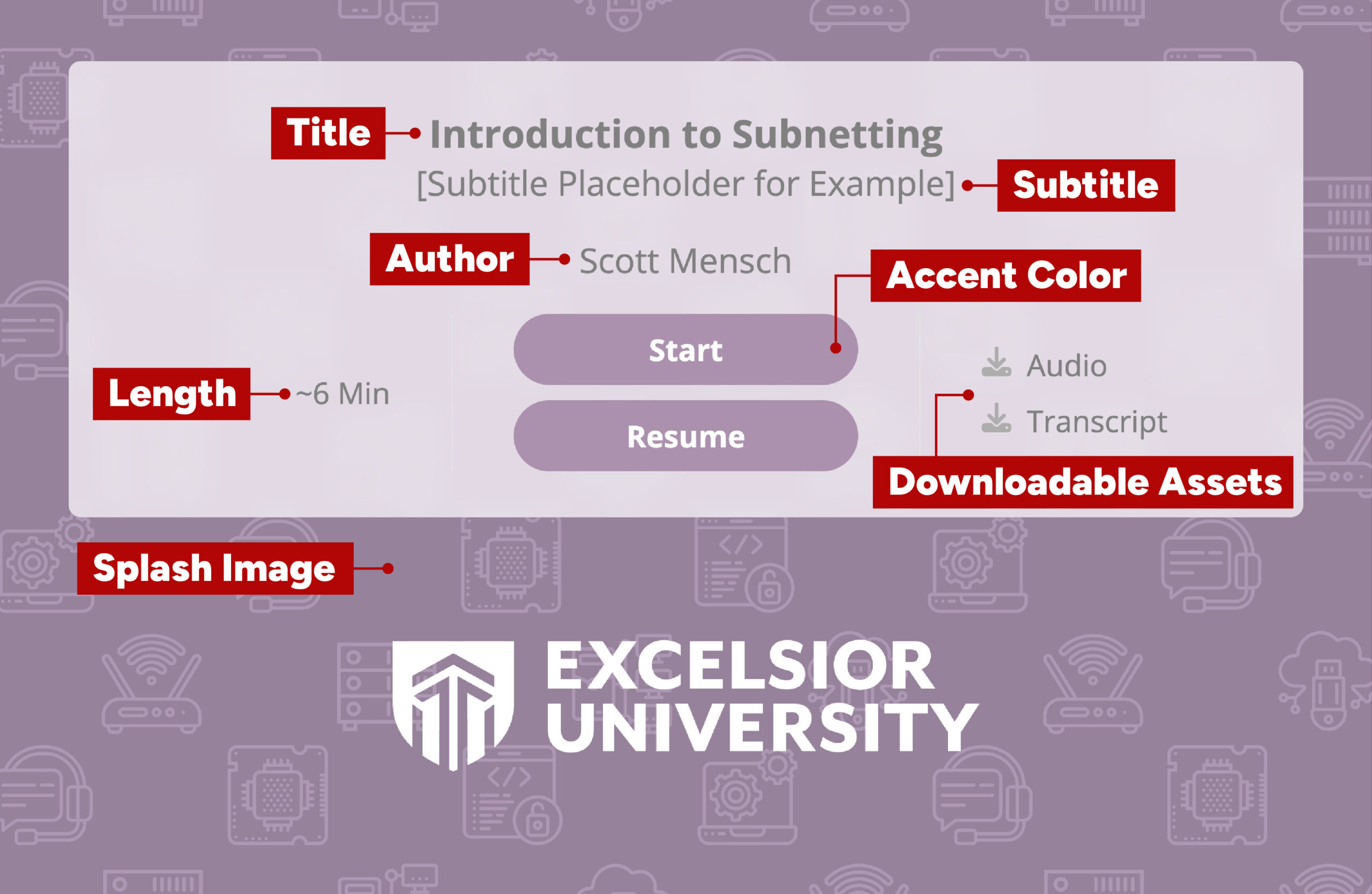
Title, Subtitle, Length, and Accent Color
These four are grouped together because they are defined in the Storybook+ XML and do not call upon any centrally located files.
Title
Every presentation should have a title and follow our titling conventions.
Subtitle
Subtitles are not mandatory and should be used infrequently, with clear justification for their inclusion.
Length
Each presentation should have its length defined and labeled as an estimate in minutes, rounded to the nearest half minute (e.g., ~10.5 min). This length should be calculated using both confirmed and estimated durations for specific slide types.
| Page Type | Length |
|---|---|
| Image | ### |
| Image-Audio | Length of audio |
| Video | Length of video |
| Quiz Question | ### |
| HTML | ### |
Accent Color
The accent color should be of these three primary colors, selected based on the PowerPoint template color scheme in use.
Main Purple
#561E66
Dark Blue
#00629B
Med Red
#9e0052
Author and Splash Image
Authors and splash images are defined in the Storybook+ XML, but call upon centrally located files on The Academics Directory (Amazon S3 Host).
Author
Not all presentations will have a defined author. Consult Nick on how to define and setup author profiles.
Splash Image
Each subject area has six available splash images; the chosen image should match the PowerPoint template in use. To use a specific splash image, specify it in the setup section of the Storybook+ XML by combining the program and theme splash names. For example, “Public Health – Colorful – Blue” would be written as public-health_color_blue.
| Program | Splash Name |
|---|---|
| All Purpose | all-purpose |
| Business | business |
| Cybersecurity | cybersecurity |
| Engineering | engineering |
| Information Technology | info-technology |
| Nuclear Technology | nuclear-tech |
| Psychology | psychology |
| Public Health | public-health |
| Technology | technology |
| Template Color | Colorful Style | Single-Hue Style |
|---|---|---|
| Purple | _color_purple |
_single_purple |
| Blue | _color_blue |
_single_blue |
| Red | _color_red |
_single_red |
Presentation Screen
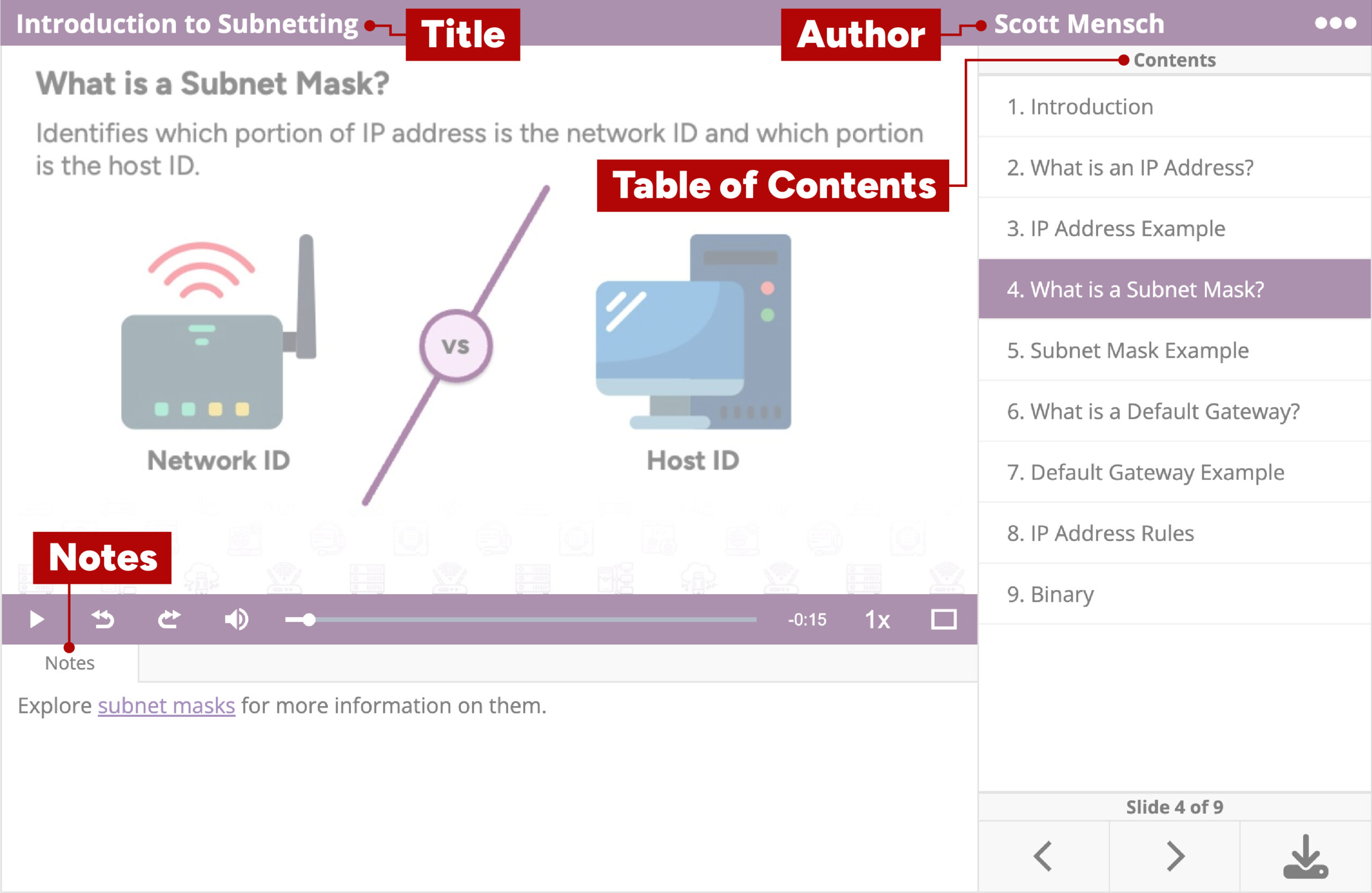
Table of Contents
Titles in the table of contents should be unique and match the slide’s title. Use sequencing names only as a last resort for creating unique titles.
Notes
- Use hyperlinked text rather than displaying the full URL unless it is contextually justified.
- Avoid the placement of citations in the notes area; keep them on the slide instead.
In-Player Assets
In-player assets include all files within the project structure that the player references, typically image and audio files, with occasional variations in boundary scenarios.
Images
- Format:
.jpeg,.jpg, or.png - Resolution:
900 x 506 - Compression: To the fullest, use ImageOptim
- File Naming:
page01,page02,page03, etc
Audio Tracks
- Processing:
- Begin tracks with 1 second of silence
- Normalize levels to a range of
-3 dBto-0.1 dB - Encoding:
.mp3,Mono, and96 kbps - File Naming:
page01,page02,page03, etc
Downloadable Assets
Downloadable assets are files that users can download from the Storybook+ player. These should always include a consolidated audio track and a structured transcript, with potential variations for specific scenarios.
Consolidated Audio
Consolidation of all individual audio tracks from a presentation into a single track.
- Encoding:
.mp3,Mono, and96 kbps - File Naming: Same as project name
Structured Transcript
Alignment of presentation audio transcription and slides.
- Format:
.pdf - Compression: For electronic distribution
- File Naming: Same as project name
Embedding
The Storybook+ Player should always be embedded using the code generated by the Embed Code Generator.
Video / Motion Design
This section assumes the video is a standalone piece hosted on Brightcove and presented via the Generic Video Player, which encompasses the vast majority of our video work. However, boundary scenarios may necessitate justified deviations; use your best judgment in those cases.
Conventions
- Should begin with our intro title template and conclude with the marketing outro.
- Use our designated lower third templates if lower thirds are included.
- Maintain a
16:9aspect ratio. - Edit/animate at a resolution of
1920x1080unless there is contextual justification for using a different resolution (e.g., receiving a video recording from a SME that is1280x720). - Use standard frame rates of
23.976/24 fpsand29.976/30 fps. Reduced frame rates of8,12, and16 fpsare acceptable for specific animation styles, such as character animation. - Overall audio mix should fall in range of
– 3bto-0.1 db. - For distribution, encode use one of Media Encoder’s
H.264 > YouTubepresets, ensuring it matches the resolution of the project. - Hosted on Brightcove and presented via the Generic Video Player.
- Must have human reviewed captions and transcript.
Brightcove
All videos should be hosted on Brightcove, properly titled, tagged, and organized with captions included. Captions are added in Brightcove, while the transcript is included in the Generic Video Player packaging. Regardless of how captions are generated, they must be reviewed for accuracy. For guidance on accessing and using Brightcove, visit the Brightcove resource page.
Generic Video Player
Videos should be presented via the Generic Video Player. For a comprehensive technical guide on using Generic Video Player, please visit Generic Video Player Technical Specifications.
Transcript
The transcript should be formatted with a header displaying the video title, followed by the transcription divided into logical sections, each marked with the corresponding timecode. Use the template linked here.
clms-video-transcript-templateEmbedding
The Generic Video Player should always be embedded using the code generated by the Embed Code Generator.
